Welcome to my new blog series where I analyze popular Toronto condo floorplans and offer my professional advice to improve them.
This week, I am reworking a 2+1 bedroom unit in the Vu South Tower at 112 George Street, near the corner of Adelaide and close to St. Lawrence Market. The building, completed in 2010, comprises 352 units ranging from approximately 400 sq. ft. to 2400 sq. ft. There is consistently high demand for condos in this building due to its decent amenities, though condo fees have steadily increased over the last decade.
The Original Floorplan
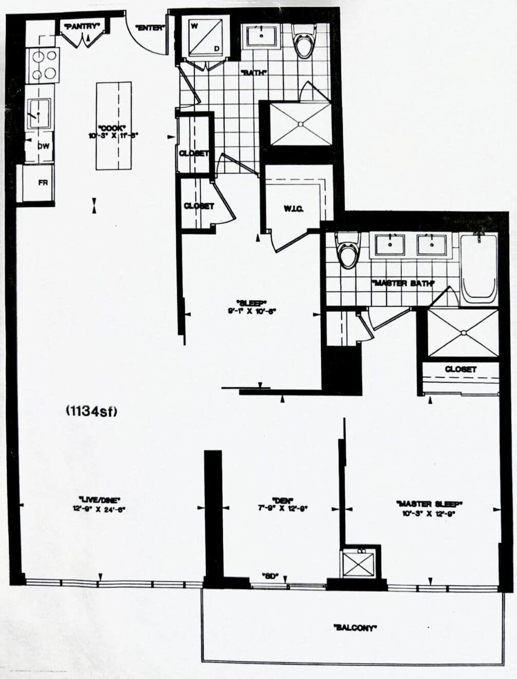
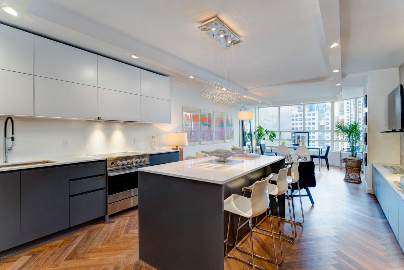
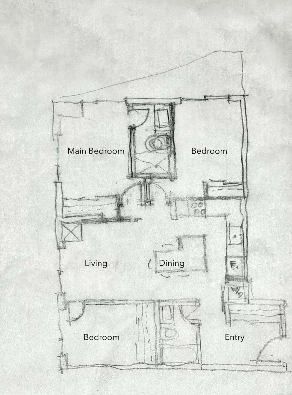
The featured unit recently sold in spring 2024 for just under $1.1 million and includes one rented parking spot. The 1,134 square-foot floor plan struck me on inspection, revealing several issues. I found the kitchen layout less than ideal, as it’s the first thing one encounters upon entering the unit. Next to the entry is a door leading directly to a washroom, followed by the coat closet. The dining area has little wall space and is adjacent to a sleeping area, which lacks privacy and has only one usable wall due to a corner of sliding doors, and a wall with two more doors, leading to the bathroom and a closet. This leaves barely any wall space against which to place a dresser, TV or art, and only one option for bed placement.
The master bedroom, while decent, lacks any distinctive features and could benefit from a more luxurious and inviting touch.
Learn more about the Toronto condo market with my latest condo guides right here:
The Re-Imagined Floorplan
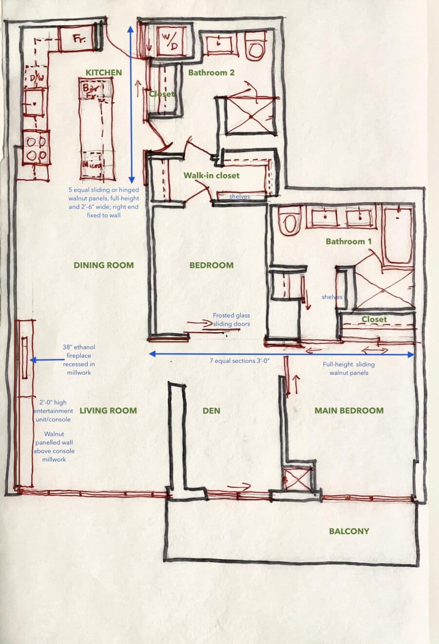
I restructured the entry and kitchen areas to create a short buffer wall at the front door and swapped the bathroom entry with the closet to introduce a warm wood-paneled wall reflecting the kitchen area, offering a more welcoming entrance. I extended the wood paneling to the length of the kitchen, accentuating that space, and increased the island size while reconfiguring the kitchen layout to establish a proper work triangle among the major appliances. I also incorporated a microwave and bar fridge under the extended island. One other point is that there is no way one will be staring at a toilet from the kitchen, now, if the bathroom door is left open!
Read more condo blogs right here:
- Toronto’s Top 5 Most Luxurious Condos
- Is it Wrong to Love Older Condo Buildings in Toronto? Or Are they Actually Better?
- Don’t be Unduly Swayed by Glitzy Condorama
I redesigned the second bedroom to have two fully usable walls, minimized space lost to closet and bathroom doors, and adjusted the entry to share daylight from the den while providing more privacy from the living areas. The bedroom now has a single door accessing the bathroom and walk-in closet area, and I have given additional shelving for shoes and accessories, then a continuation to the bathroom entry.
In the dining room, a full wall to accommodate art or a console table now exists, and I added built-in millwork in the living area above which art or a television could be hung and it contains an ethanol fireplace, visible from the living, dining, and kitchen areas, as well as along an axis from the main bedroom doorway. I enhanced this with a series of equal-sized wall panels to create visual rhythm.
All changes respect the building’s structure and plumbing, involving only minor adjustments with easily constructed steel stud and drywall partitions, rich wood paneling, and custom millwork. With these enhancements, I expect the unit to one day fetch considerably more than its recent sale price, while offering a more appealing and functional living space for future buyers.
Looking forward to exploring more creative architectural ideas next week…
Looking for buying or selling advice in Toronto? Reach out directly by calling 416-824-1242, emailing robert@lifeofluxury.ca, or filling out the form on this page.
Guiding Your Experience
Learn more about how I work with you to create unique strategies that help make your dream lifestyle your actual lifestyle.
