There are certain things that can ruin an otherwise good composition almost instantly. A potentially attractive person with terrible hair. A handsome car sitting on cheap hubcaps instead of proper alloy wheels. The underlying thing may still be good, but one bad decision somehow manages to drag everything else down with it.
Houses are no different.
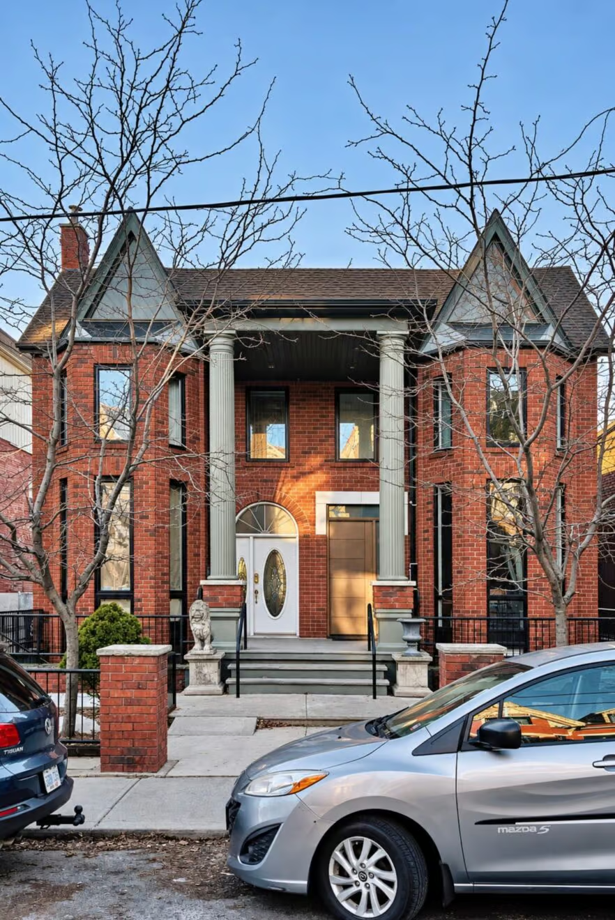
I have seen more crimes against design than I care to remember, many of them committed with the very best intentions. Someone buys an older house and decides the windows need replacing, which may be perfectly reasonable. But instead of choosing something with the correct proportions and detailing, they install new windows with fake muntin bars because they think this will somehow make them look historical. Usually, it does the opposite. They look cheap, decorative and entirely disconnected from the architecture.
Then there are the slider windows.
Toronto is full of late nineteenth- and early twentieth-century houses whose original windows were replaced at some point with horizontal sliders. They were probably sold as practical — easy to operate, inexpensive and good for ventilation — but aesthetically they can be disastrous. A tall, beautifully proportioned opening that once had a vertical emphasis suddenly gets divided horizontally by a clumsy sliding unit. The proportions of the entire façade change. Once you notice them, you see them everywhere. I sometimes think half the older houses in Toronto have been afflicted with them. Perhaps that is an exaggeration, but walking through many downtown neighbourhoods, it certainly doesn’t feel like one.
The same thing happens with exterior materials.
Wooden shingles and siding that once gave houses texture and depth were frequently covered over with aluminum. There is an astonishing amount of aluminum siding in Toronto, much of it applied to houses that must have been far more attractive before it arrived. Even when the finish is supposedly matte, at night you can catch the light reflecting off whole streets of it. Neighbourhoods that were once made up of wood, brick, shingles and beautifully detailed façades can begin to feel like collections of old cans lined up along the road.
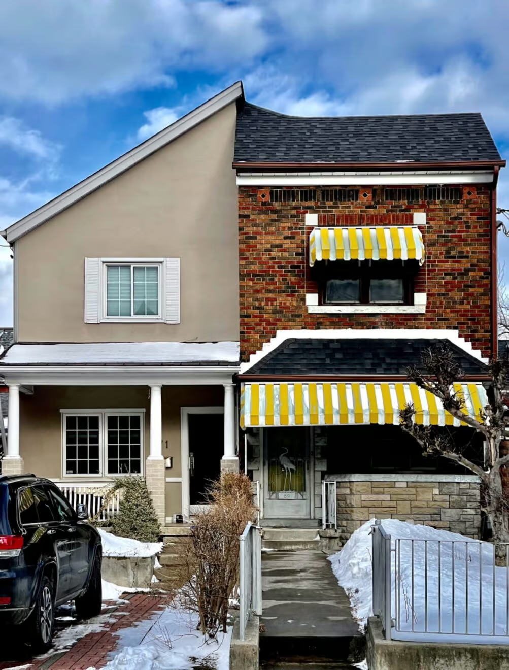
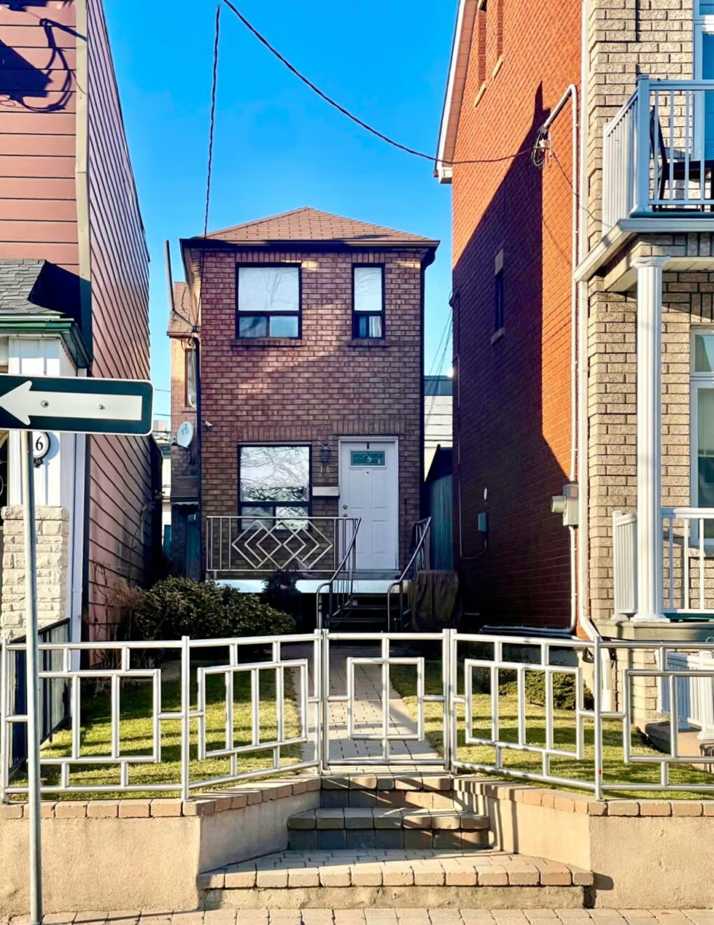
Then perhaps someone replaces the front door with a standard catalogue unit featuring one of those inexplicable half-moon windows that proliferated for years. Add some poor hardware, a token little fence around the garden where a hedge or properly conceived picket fence would have been far better, and suddenly a perfectly attractive house has lost its dignity.
None of this necessarily involves spending less money.
Sometimes people spend quite a lot in order to make something worse.
I have seen beautiful wood shingles removed when they still had years of life in them and replaced with flat, characterless asphalt shingles. I have seen trim added to perfectly respectable older houses in the hope of creating Victorian charm, only for the result to resemble a celebration of Brampton, 1982. I have seen attractive brick houses in Hogg’s Hollow stuccoed over, then decorated with miscellaneous patches of stone as though fragments of some ancient ruin had somehow emerged through the surface. And just in case you might miss them, soffit lights are installed to illuminate these architectural bed sores after dark.
Budget matters, of course. Not everyone has the means to execute every detail perfectly, and there is nothing wrong with making sensible compromises. The problem is not affordability. It is spending money without understanding what you already have.
For more on this, read my post: How to Renovate a Character Home without Destroying Its Character
My parents’ house is perhaps the example that still bothers me most.
It was built in 1963 in a neighbourhood conceived by a mid-century modern architect, where the houses were deliberately positioned and designed to celebrate the architecture of that period. My parents’ house had flat roofs, multiple levels, large expanses of glass and materials that gave it tremendous warmth. There were cork floors that survived beautifully for some sixty years, bookmatched wood doors, long thin Roman-brick fireplace walls, open-tread stairs and wonderful views through the house. The library had tongue-and-groove redwood walls and ceiling, along with built-in shelving. Some of the lighting from the 1960s and ’70s had come full circle and was looking remarkably chic again.
The bedrooms all had sliding glass doors opening onto a balcony roughly fifty feet long, overlooking a creek and a wooded backyard.
It was one of those houses where the architecture did not shout at you, but the experience of moving through it made complete sense.
We eventually sold it to someone who apparently considered himself a rather savvy house flipper. He was a plastic surgeon, and I can only hope the faces he remodelled were treated with more sensitivity than my parents’ house.
Nearly every trace of the mid-century character was stripped away. The Roman-brick fireplaces disappeared beneath fake-marble porcelain panels. The cork flooring was removed and replaced with inexpensive generic flooring. The wonderful redwood library was painted away and the built-in shelving disappeared in favour of a Murphy bed. A beautiful teak wall visible through the open staircase was removed. Spaces that were already connected and relatively open, but which had rhythm and circulation between them, were simply blown apart into one enormous room.
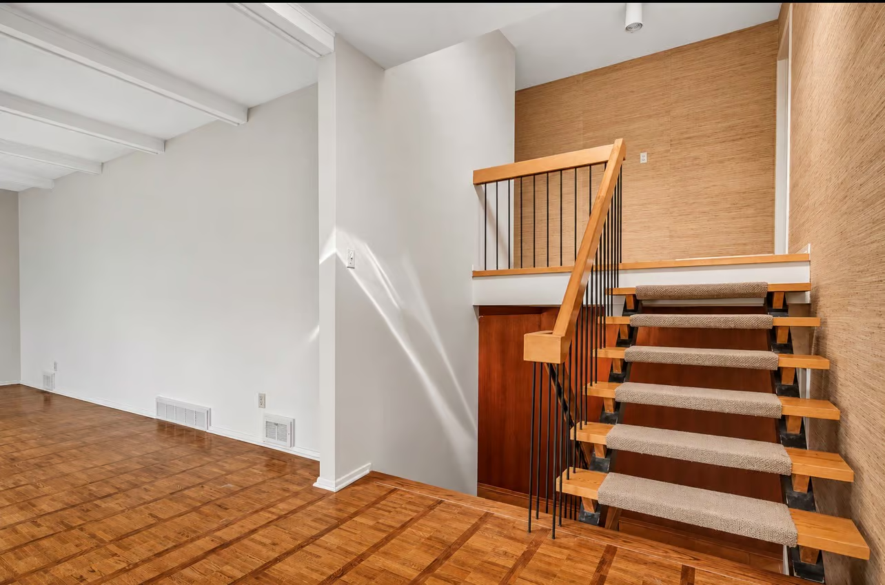
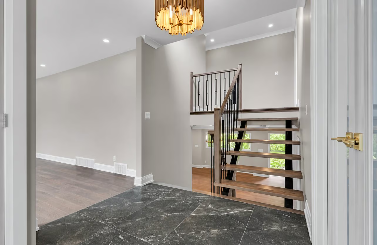
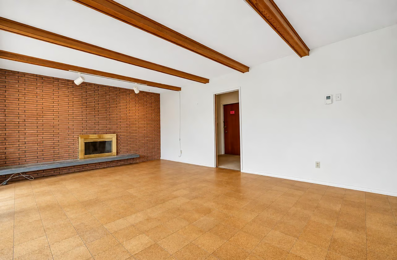
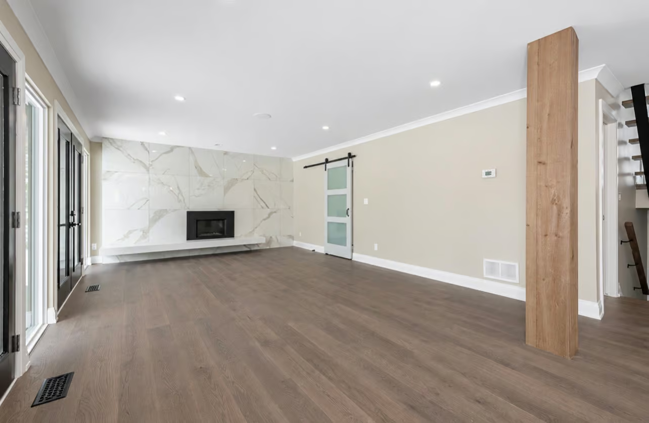
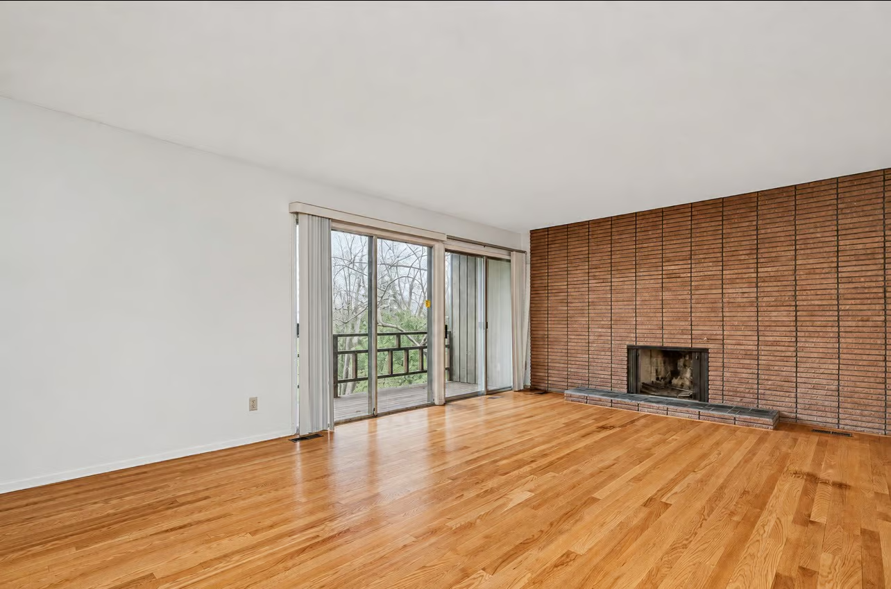
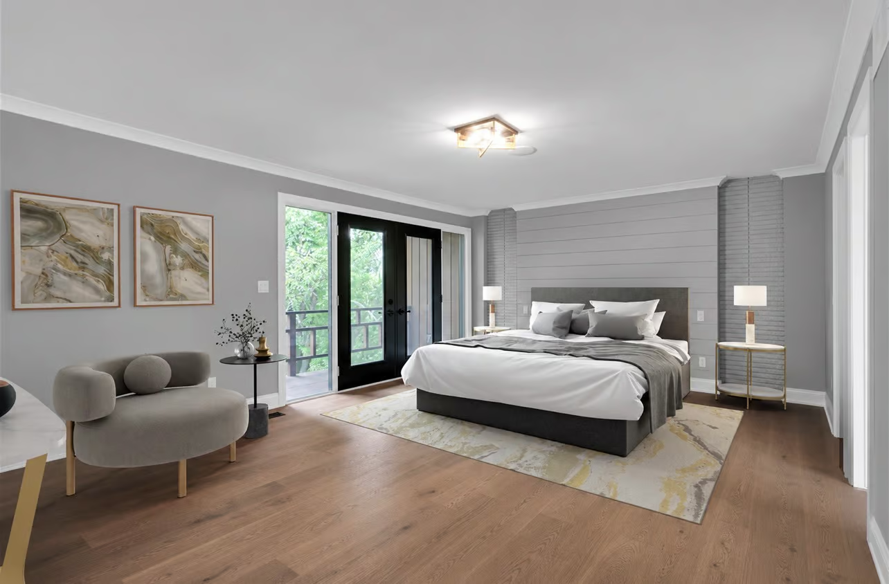
The garden level became something approaching fifty feet by twenty feet of largely undifferentiated space. I can only imagine the acoustics. Bowling alley comes to mind.
Even more strangely, the kitchen was moved into the former dining area to take advantage of the floor-to-ceiling garden windows, which in itself was not a terrible idea. But the original kitchen had beautifully placed higher windows above the counters. Once that space became the dining area, those high windows remained, meaning the new dining table sat underneath them with virtually no useful view outside. Apparently, looking at the garden while eating dinner had not made it onto the programme.
To his credit, he replaced the most of the old redwood-framed windows while maintaining their proportions, and he left the open-tread staircase intact. But these surviving pieces only made the loss of everything around them more obvious.
What was particularly unfortunate was that the neighbourhood itself had been remarkably respectful of its architectural origins. Other houses had been renovated, expanded and altered, but generally with some understanding of what made them special in the first place. My parents’ house had been one of the stronger survivors. Then, suddenly, it was disrobed.
A couple of years later, a friend sent me an Instagram post from an account devoted to unfortunate renovations.
There was my parents’ house, with the old listing photographs being used to demonstrate what had been lost. I found it depressing, but also oddly reassuring. Somebody who had never lived there and had no sentimental attachment to the house could still see what had happened.
And, somewhat ironically, I don’t think the exercise even worked financially. The house remained on the market for roughly eight months, was relisted several times, changed brokers, and ultimately sold for about half a million dollars less than the original asking price. Yes, the eventual sale price was higher than what he had paid us for the house, but that hardly tells the whole story. Once I factor in land transfer taxes on the purchase, the cost of all those renovations, carrying costs, and real estate commissions when he eventually sold, my rough calculation is that he probably lost a couple of hundred thousand dollars on the adventure. He managed to remove much of what made the house special and seemingly lost money doing it. There may be a lesson in there somewhere.
I’ve spent my life building, renovating, and selling homes. Learn about the house that started it all with my three-part renovation series:
- Stories of Architecture, Homes, and a Life By Design – Part 1
- Stories of Architecture, Homes, and a Life By Design – Part 2
- Stories of Architecture, Homes, and a Life By Design – Part 3
That, to me, is one of the great mistakes in renovation: confusing new with better.
There are plenty of things that should be replaced. Windows fail. Bathrooms become tired. Doors become warped or flimsy. Mechanical systems become obsolete. Good renovation is not about preservation for its own sake. If an old hollow-core door is ugly and battered, replace it with a beautifully detailed solid-core one. But if the existing door is bookmatched wood and contributes warmth and character, perhaps pause before throwing it into a dumpster.
The same applies to finishes and hardware. Black hardware became enormously fashionable, but much of it has not aged particularly gracefully. The black coating eventually wears through and reveals the brass beneath — which at least proves there was some decent metal hiding underneath. Meanwhile, chrome, nickel, brushed metals and brass somehow survived decades without requiring anyone to declare them “back.” They are classic because they age naturally rather than announcing precisely which five-year period the renovation occurred in.
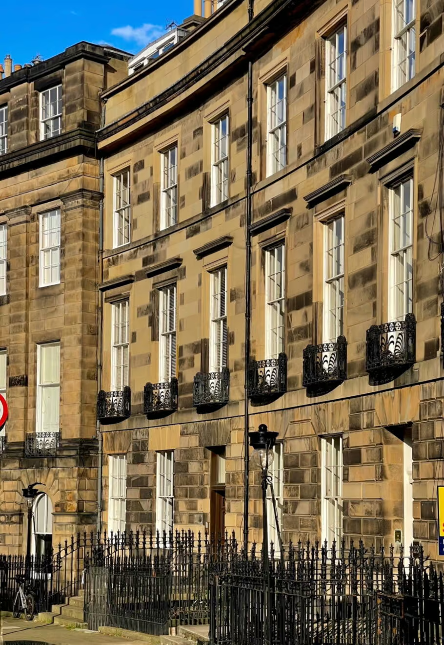
One of the larger problems, particularly in newer North American cities, is simply that architectural literacy is uneven. Toronto has some excellent architecture, but many of us did not grow up surrounded by centuries of coherent urban fabric in the way someone in London, Paris, Rome or Edinburgh might have. In those places, proportion and material are absorbed almost unconsciously. You walk past Georgian terraces, Haussmann apartment buildings, medieval streets, Victorian houses and contemporary interventions every day. You may not know the terminology, but you become accustomed to seeing things that have been considered.
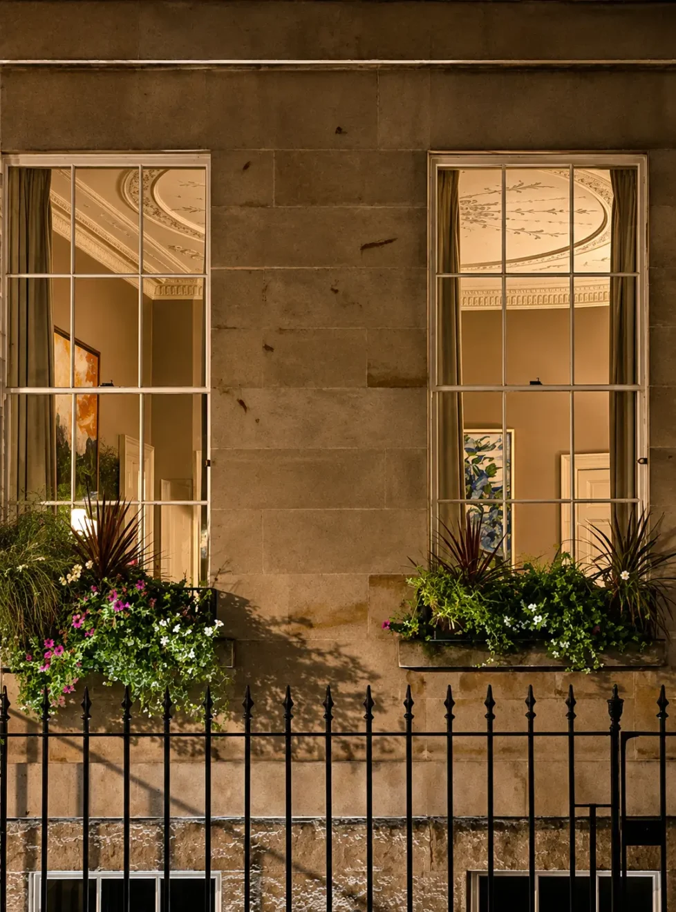
Edinburgh has always fascinated me for this reason. Its New Town is more than two hundred years old and yet still feels remarkably crisp, disciplined and almost contemporary in its proportions. I sometimes think of my grandparents growing up there in the late 19th century and walking past essentially the same street corners in the late nineteenth century that I see today. There is something extraordinary about that continuity.
Join me on a tour of 18 India Street in Edinburgh’s New Town.

And yet respect for architecture does not mean freezing cities in amber. London, Paris and Rome all accommodate strong contemporary design. Mexico is another place where I am continually struck by the quality of modern architecture: clean lines, beautiful materials, restraint and extraordinary handling of light. Good contemporary work can sit beside older architecture perfectly well when both have been conceived intelligently.

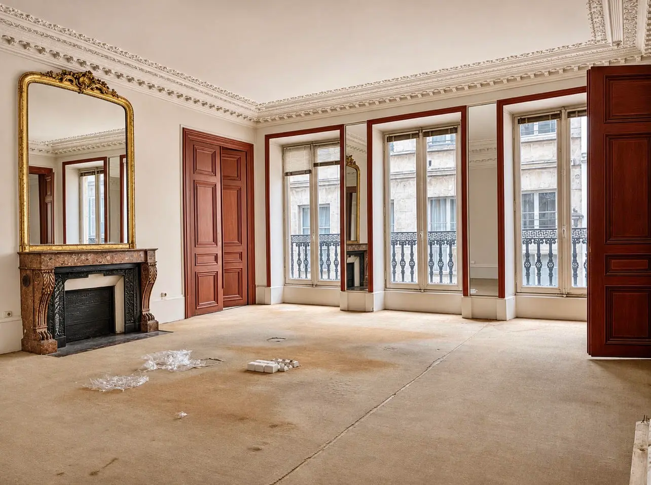
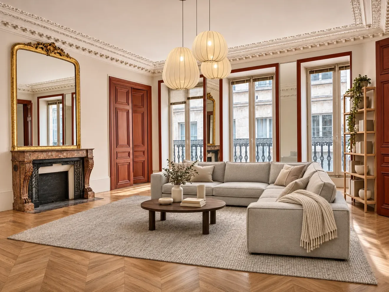
The problem comes when alterations are made with no understanding of the building or its surroundings.
Open-plan living is a good example. I happen to like open spaces, but openness is not the same thing as removing every wall in sight. A large room still needs rhythm, proportion and cues that suggest how it should be used. Otherwise, it can start to feel like a particularly expensive church basement.
Even something as mundane as a bulkhead can help. Architects normally try to avoid them where possible, but sometimes structure, ductwork or plumbing has to go somewhere. If considered properly, a bulkhead can help define an open kitchen, dining area or living space without enclosing it. It can subtly organize a much larger volume into more intimate zones.
At the opposite extreme, I often look at British floor plans and find myself completely bamboozled. Tiny London houses and flats can contain corridors leading to doors leading to reception rooms leading to another door, while the bathroom has somehow ended up at the end of the kitchen and nowhere near the bedrooms. There are times when I want to take a pencil and remove half the walls. But the underlying principle remains the same: zoning matters. People need to understand where one activity ends and another begins, even if there is no wall between them.
If you’re interested in terrible floor plans, read through my Condo Chronicles blog series where I review and improve popular Toronto condo floor plans.
Then there is fashion masquerading as architecture.
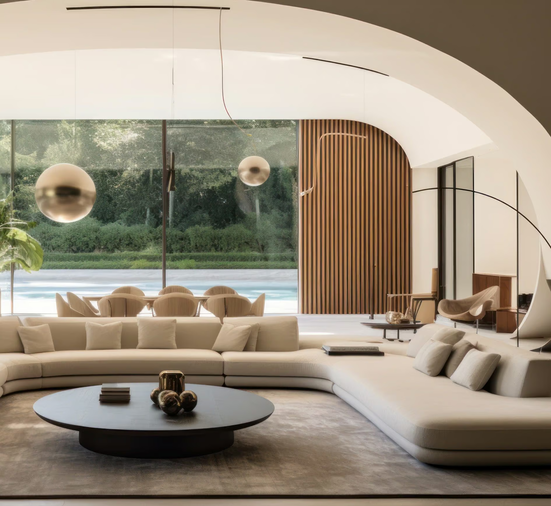
Everything is white now. White walls, white kitchens, white boucle furniture, pale floors, pale rugs, pale everything. It is safe, attractive enough and almost impossible to object to — which is precisely the problem.
There was a time when painting an older interior white could be genuinely radical. In the 1960s, someone might whitewash an old house, open a few walls while retaining the original architectural details, then introduce a Persian rug, Bauhaus furniture, a few inherited antiques and some extraordinary paintings. The white was a backdrop to a life.
Today, too often, the white has become the life.
You walk into one staged house after another and recognize the same showroom furniture. The white bouclé sofa from Must. The familiar pieces from Structube. The inevitable IKEA item whose Swedish name you may not remember but which you recognize instantly. There is nothing inherently wrong with any of these things, but when a house becomes an assemblage of whatever happens to be readily available this season, there is very little sense of authorship.
The best houses are curated rather than decorated all at once. Objects accumulate. Something belonged to a parent. Something came from a trip. A chair was bought thirty years ago. A painting suddenly made sense in a particular room. These layers are what give a house warmth and make it feel inhabited rather than merchandised.
I have seen this directly in real estate. Developers sometimes resist staging because they cannot understand why a brand-new, pristine house needs anything added to it. I have occasionally told them that if they could somehow live in the house for six months and allow it to acquire a little soul, it might actually sell more easily.
They generally think I am mad.
But I have watched lived-in newer houses sell for more than pristine vacant ones. The difference is often that the occupied house tells a story. Buyers can understand how it works. They can imagine themselves there. The perfect empty one can feel clinical and antiseptic, however expensive the finishes.
Selling a home with character takes a special eye. Keep reading these posts next to see what you should look for in a real estate agent when selling a unique property:
- Selling a House is a Project, Your Agent Should Know How to Run One
- Why Your Real Estate Agent Should Be a Homeowner
- Benefits of Working with an Architect Real Estate Agent
Renovations can absolutely reduce value for the same reason.
People sometimes assume that if they spent $300,000 renovating something, the house must therefore be worth $300,000 more. But buyers do not calculate value that way. They walk through and think, “I love the house, but I hate what they did to the kitchen,” or, “I’m going to have to remove all of this.”
Then they subtract.
They may be calculating the cost of redoing something that has literally just been redone.
There is a very expensive condominium in Toronto that has been on and off the market for the better part of a dozen years. It has been finished with such exuberant displays of luxury that it feels less like a sophisticated residence and more like Richie Rich’s house from the comic books. At one point, perhaps that degree of conspicuous decoration represented aspiration. Today, it feels strangely dated.
People with money are often far less interested in broadcasting it now. Refinement tends to demonstrate wealth more effectively than excess. A beautifully executed room with excellent proportions, materials and restraint suggests that somebody spent time thinking. The money is evident without every surface demanding that you notice how expensive it was.
Perhaps that is the real dividing line.
Good design rarely needs to explain itself.
People may not know why a house feels right. They may not know the terms for proportion, rhythm, fenestration, hierarchy or circulation. But they feel the difference. They know when a room has warmth. They know when a façade is balanced. They know when one space leads naturally into another.
And they know when something is wrong.
The greatest crime against design is not having unfashionable taste or liking the wrong colour. It is failing to understand what was good before you arrived, then spending considerable time and money removing it.
A successful renovation should leave a building better, not simply newer.
For more on selling and renovating older homes, get in touch with me today. Call / Email me directly or fill out the form on this page.

Find Your Life of Luxury
Whether buying or selling a home, I can help you find your life of luxury. Get started today.